Custom Mobile-First Design
We create designs optimized for mobile devices while ensuring seamless scalability to larger screens.
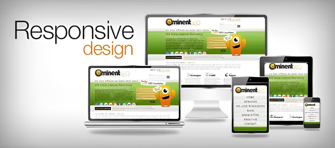
Cross-Device Compatibility
Our designs guarantee flawless performance on desktops, laptops, tablets, and smartphones.
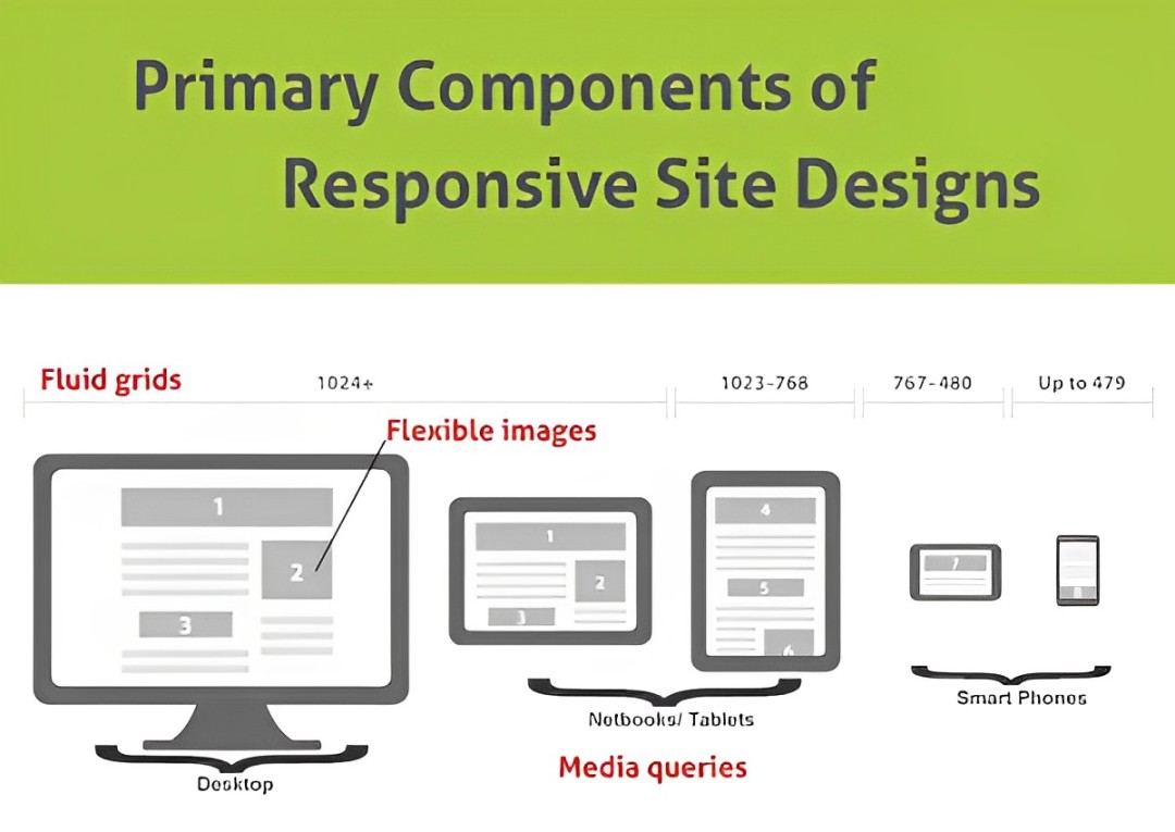
Fluid Grid Layouts
We use flexible grid systems that dynamically resize based on the user's screen size.
Scalable Images and Media
All visual elements, from images to videos, are optimized to maintain quality and load quickly on any device.
Interactive and Intuitive Interfaces
Enhance engagement with user-friendly navigation, touch-optimized buttons, and smooth scrolling features.
Responsive Testing
We rigorously test your website across multiple devices and browsers to ensure consistent performance.